
Tuesday, May 21, 2013
Monday, May 20, 2013

Thursday, May 16, 2013

Friday, May 10, 2013


Thursday, May 2, 2013


Tuesday, April 23, 2013


Friday, April 19, 2013
perfume advertisesment


Monday, April 15, 2013
glamour shot


Friday, April 12, 2013
Makeover
.JPG)

Thursday, April 11, 2013
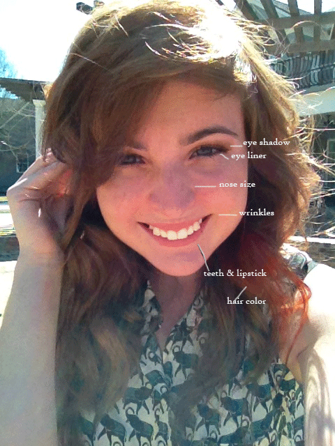
skin tone

Wednesday, April 10, 2013
Wrinkle Removal

Whiten Teeth

Eye Makeup

Change Hair Color

Tuesday, April 9, 2013
modify nose
.gif)
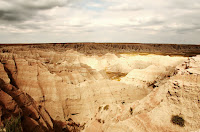
Removing object from photo


Thursday, April 4, 2013
clone/healing/repair tools


I learned how to use the patch tool in the first picture, the cloning healing brush in the second, and the content aware tool in the third, to get rid of parts of the image i dont want in the photo.
Monday, April 1, 2013
Advertisement


Final Product.
My target audience was students. Since students are younger I chose a vintage sort of look with books. I chose faded deeper colors to give it a retro sort of old look. I chose a type writer sort of font as well to add to the retro look. I added a faded wood layer mask over the whole picture to make it look more vintage. And voila. Here's to some Good Morning Sunshine Coffee!
Friday, March 22, 2013
Movie Poster
I used this tutorial: http://designinstruct.com/digital-art/make-a-vintage-planetary-landscape-poster-in-photoshop/
These are my source images:


Final product: For this project I started with the galaxy picture and added a gradient to it to make it look more vintage. Then I cut out the desert and added that to the picture, after that I cut out the clouds added a few gradients and darkened them and added them to the picture. Then I created the planet from the texture picture with some inner and outer shadow and adding some lines to it. I then added the text in Garamond font on top. Then I created a circle and placed it over the middle text and cut it out in order for it to show through and voila!

Friday, March 8, 2013
Vintage Poster


In this tutorial I worked a lot with the burn tool and different overlay and color burn effects. I cut out my figure from the second picture and placed it onto a vintage paper image and then i cut out the giraffe head and placed in on my head. I used drop shaddow and color burn to give it a sort of 3d effect.

Friday, February 22, 2013
Contrast Project


For the image I used the same image as my grunge project of Logan Lerman, I For this I learned how to use a lot of different layer combinations with the layer adjustments and high passes in order to give the photo an older kinda grungy look. I made probably like seven passes some with saturation and some with curves to get this look. For the Letters I added inner shadow and drop shadows to give them a more 3D look, as well as transformed them to different sizes and going different angles. On the image of Logan I added an outer glow. For the background I chose a color and then added two patterns to give it a more grungy look. I didn't use a tutorial, I kinda did what I learned from everything and made my own thing.
Wednesday, February 20, 2013
Grunge


For this I learned how to use a lot of different layer combinations with the layer adjustments and high passes in order to give the photo an older kinda grungy look. I made probably like seven passes some with saturation and some with curves to get this look.
Subscribe to:
Posts (Atom)