Friday, February 22, 2013
Contrast Project
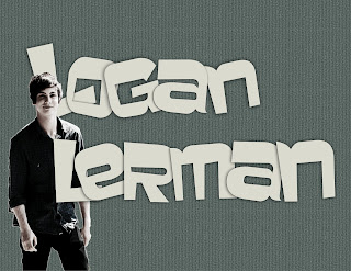
For the image I used the same image as my grunge project of Logan Lerman, I For this I learned how to use a lot of different layer combinations with the layer adjustments and high passes in order to give the photo an older kinda grungy look. I made probably like seven passes some with saturation and some with curves to get this look. For the Letters I added inner shadow and drop shadows to give them a more 3D look, as well as transformed them to different sizes and going different angles. On the image of Logan I added an outer glow. For the background I chose a color and then added two patterns to give it a more grungy look. I didn't use a tutorial, I kinda did what I learned from everything and made my own thing.
Subscribe to:
Post Comments (Atom)


No comments:
Post a Comment